SPOINT
Product Design, 2024
Redesigning Spoint through a content-first approach
I redesigned Spoint using a content-first approach to simplify complex product journeys and improve usability.
By restructuring information architecture, simplifying language, and clarifying core flows, the redesign made the product easier to understand and navigate.
USER RETENTION+32%
Increase in user retention within a 60-day window after the redesign.
USER SATISFACTION+10 NPS
Users reported higher satisfaction with the clarity and usability of the product.
PRODUCT CLARITY↑
Content complexity dropped from university-level reading to secondary school level.
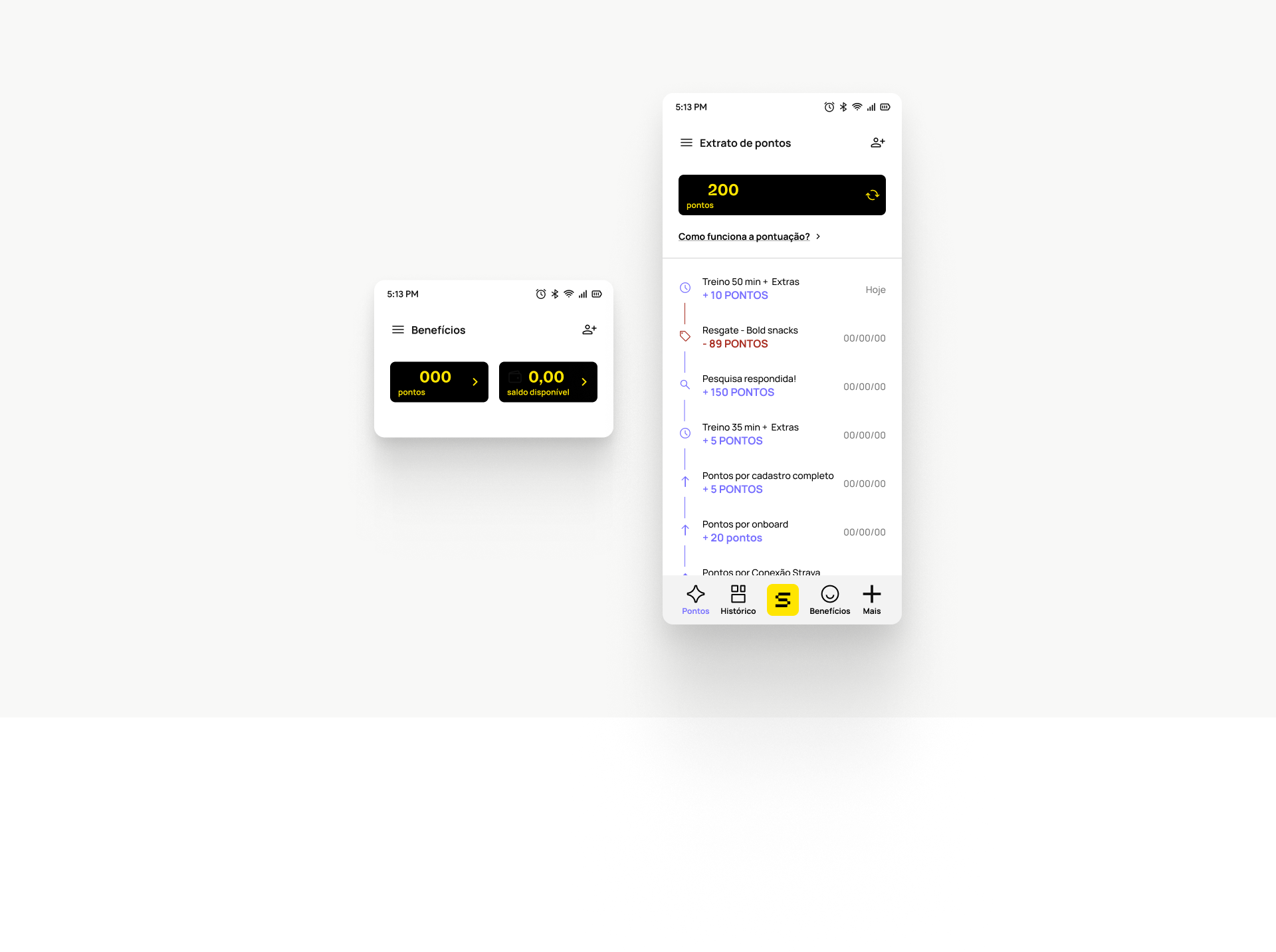
Problem
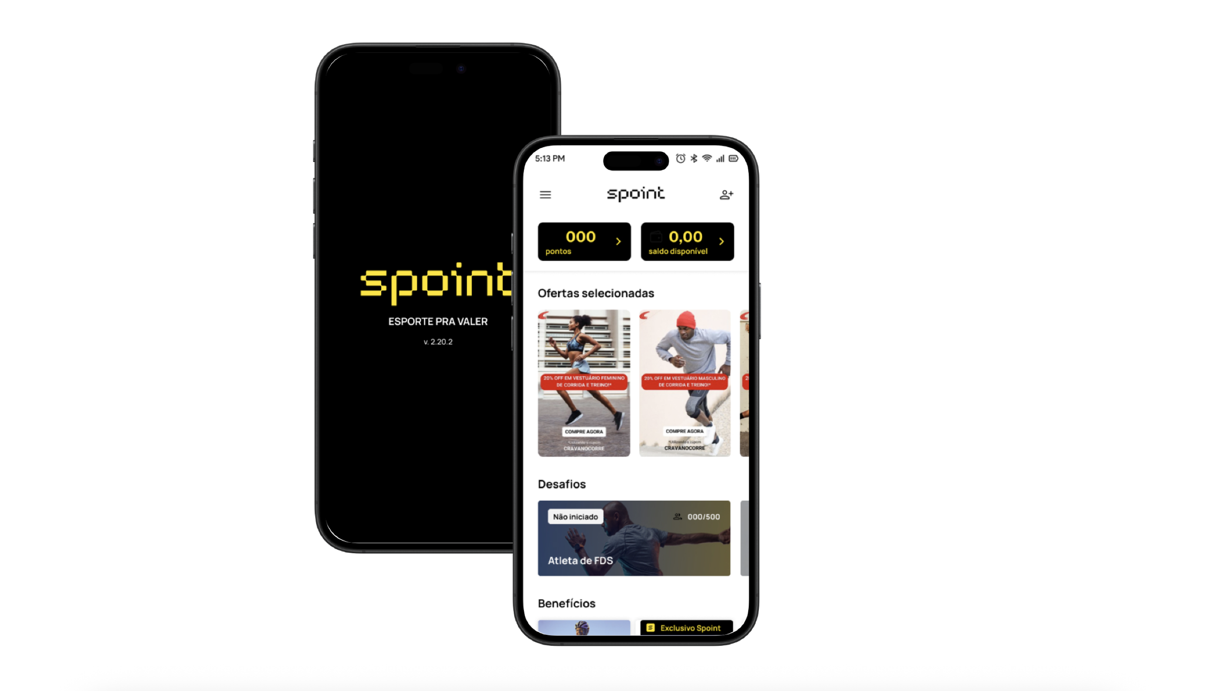
Spoint is a mobile app that rewards users with points for completing sports-related activities and challenges.
Despite strong acquisition, retention remained low. A large portion of users stopped using the app within the first 60 days after installation, and uninstall rates increased.
Key concepts such as rules, deadlines and the points system were difficult to understand early in the experience, creating friction in critical journeys.
As a result, the product struggled to convert new users into active participant
Approach
To explore and discover the situation, I combined qualitative and quantitative research.
I conducted 12 user interviews, analysed 228 app store reviews, and ran usability tests across two core journeys. In parallel, I performed readability checks across eight key flows to evaluate content complexity.
The research revealed three main issues: users did not understand how the points system worked, they struggled to find rules and deadlines, and key journeys required a reading level higher than recommended for digital products.
The insight was clear: the product’s language and structure were creating unnecessary cognitive effort.
Solution
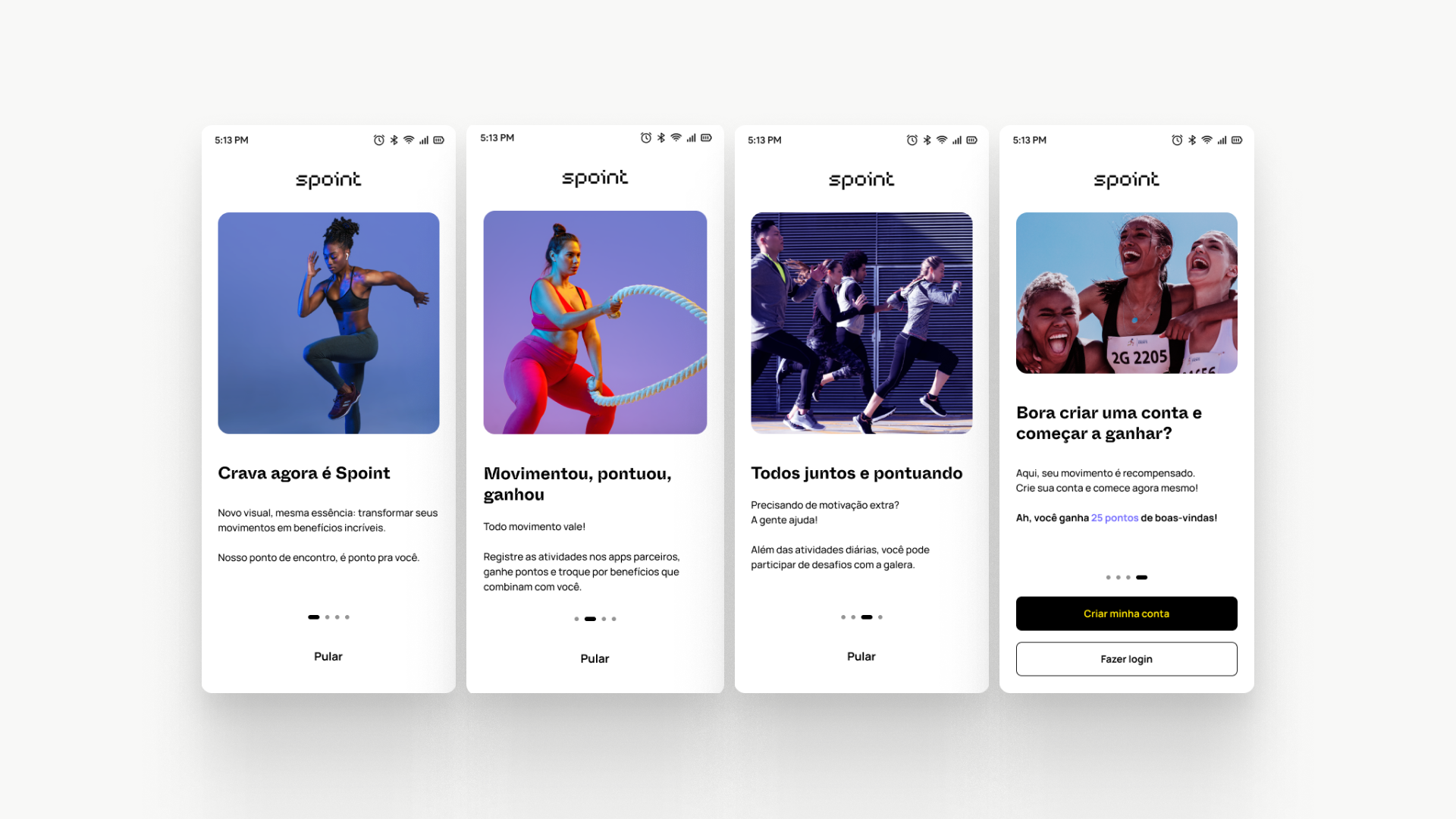
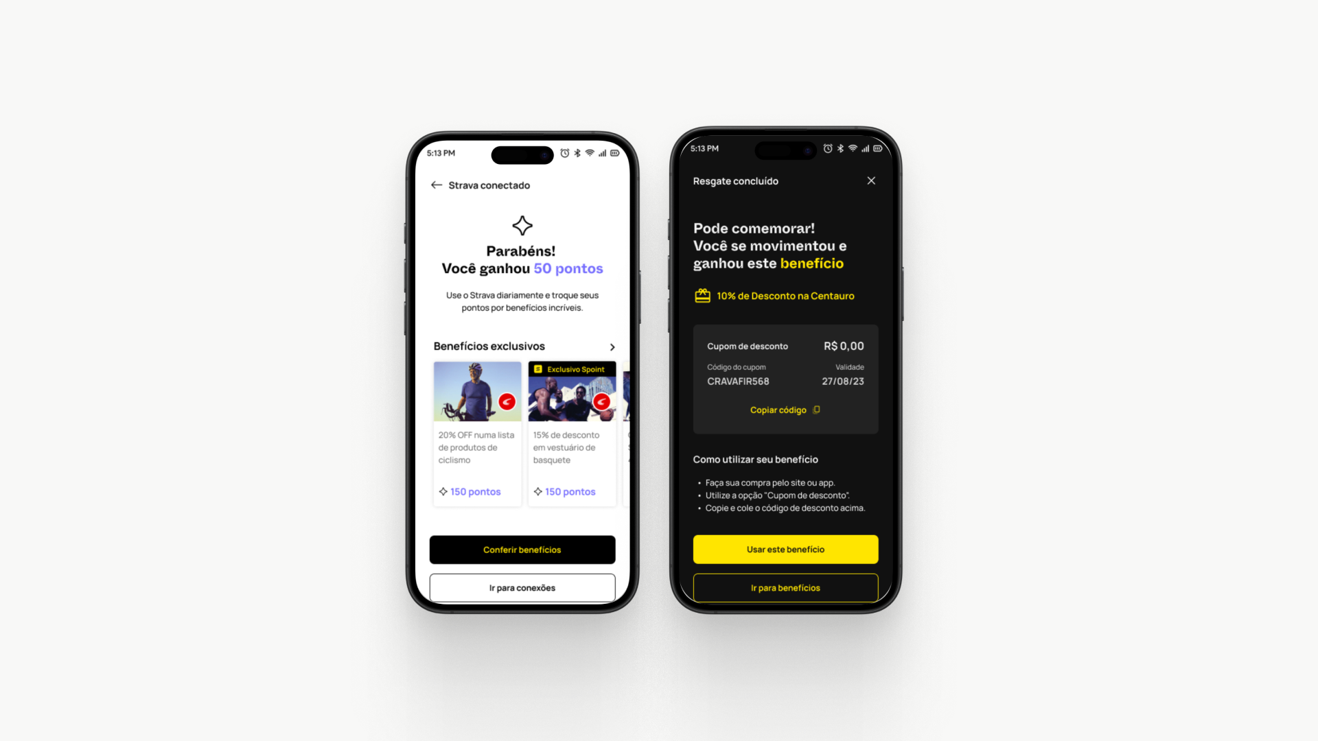
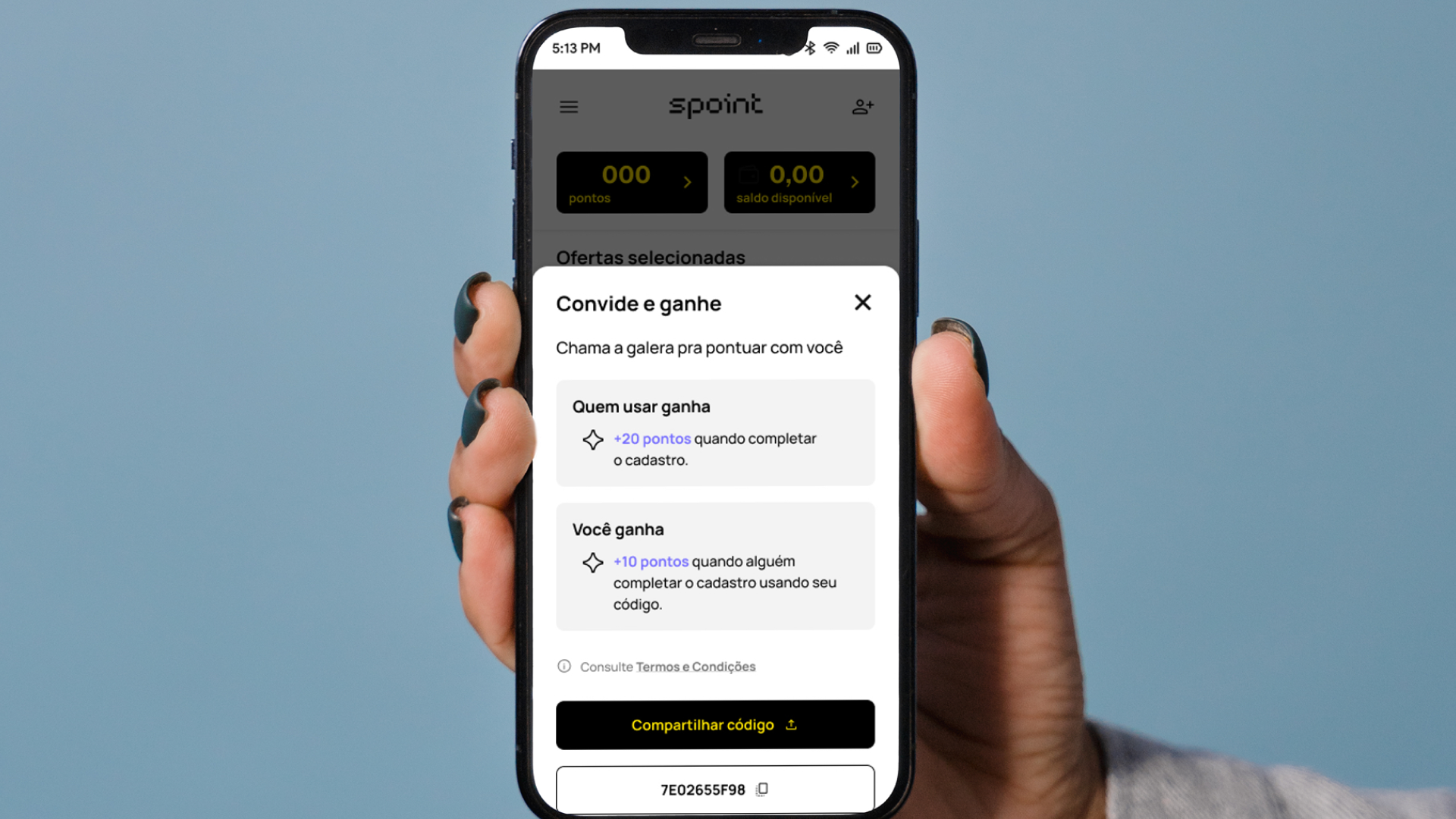
I redesigned Spoint’s core journeys using a content-first approach focused on clarity and accessibility.
First, I restructured the information architecture to better align with user actions and reduce content fragmentation. This made rules, deadlines, and the points system easier to locate and understand.
Next, I simplified language across the product using plain language principles and shorter, more scannable content patterns.
Finally, I redesigned key flows such as onboarding and rewards, introducing clearer guidance and microcopy to help users understand what to do at each step.
These changes reduced reading complexity and improved comprehension across the experience.

Outcomes & Learning
The redesign improved clarity across the product and significantly reduced cognitive load for users.
Readability analysis showed that content complexity dropped from university-level reading to secondary school level, making the product easier to understand for a broader audience.
Usability testing confirmed these improvements: all participants understood how the app worked, and most reported feeling more confident navigating the core journeys.
This project reinforced the importance of treating content as a structural part of the product experience. When information architecture and language are designed together, complex products become significantly easier to understand and use.