Redesigning Spoint through a content-first approach
We redesigned Spoint’s core journeys using a content-first approach to improve clarity and increase user retention.
PRODUCT DESIGNER
SPOINT
2024
REWARDS/FITNESS
PRODUCT DESIGNER (2)
PRODUCT MANAGER (1)
ENGINEERS (2)
ROLE
COMPANY
YEAR
INDUSTRY
TEAM
OVERVIEW
Improving retention by making the product easier to understand
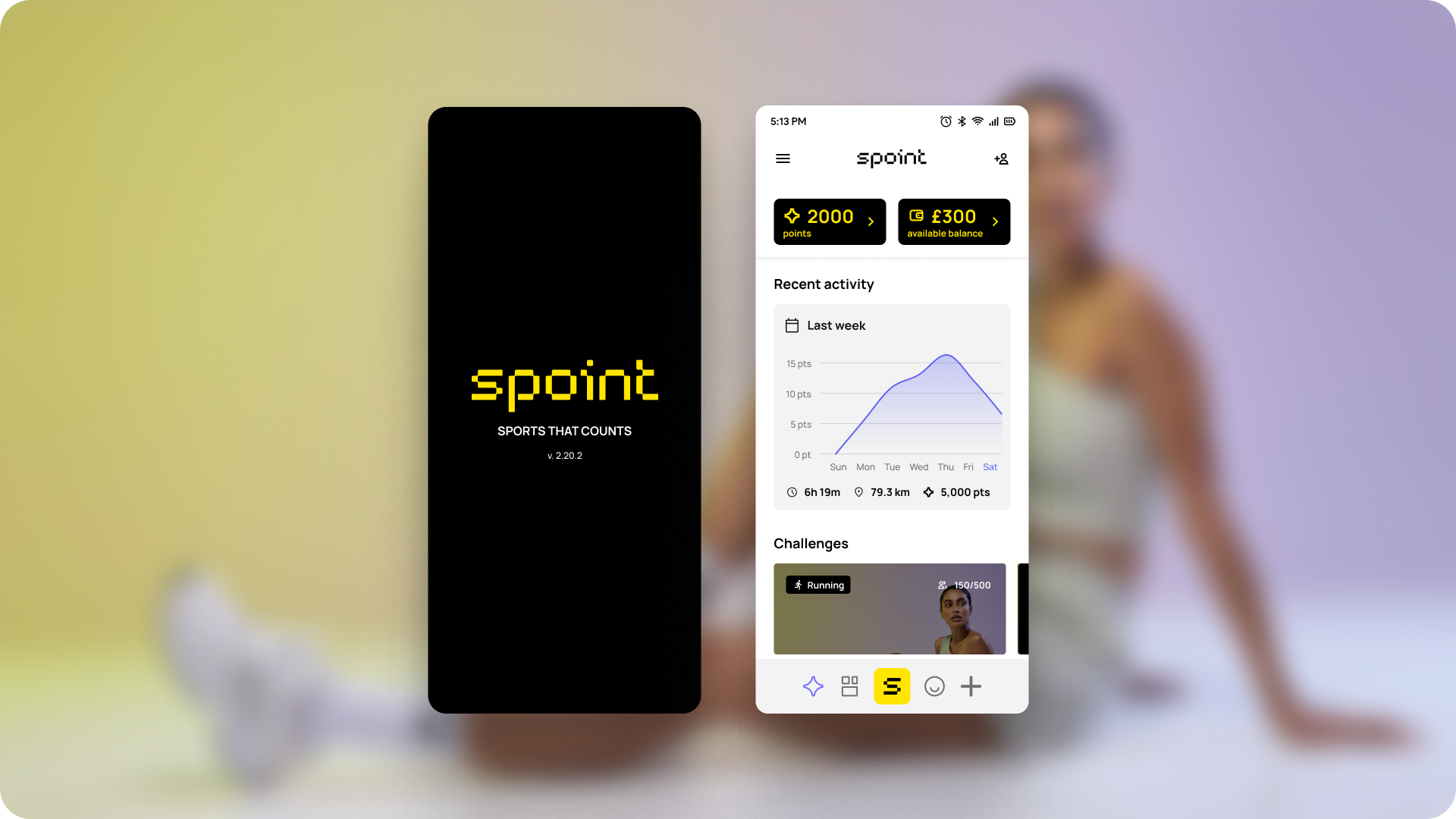
Spoint is a rewards app where users track physical activities to earn points, which can be exchanged for discounts, promo codes and benefits across Grupo SBF brands such as Centauro, Nike BR, Studio 78 and Fit Dance.
Low retention was limiting the product’s value for both users and partners. To address this, we redesigned the experience using a content-first approach, improving clarity across key journeys.
USER RETENTION
+32%
Increase in user retention within a 60-day window after the redesign.
USER SATISFACTION
+10
Users reported higher satisfaction with the clarity and usability of the product.
CHURN REDUCTION
↓
Clearer rules, deadlines, and points explanations reduced early drop-off.
PROBLEM
Low retention was limiting product value and partner growth
By 2023, Low retention reduced the value of the product for external partners, making it harder to expand the programme.
Users struggled to understand how the app worked. Rules, deadlines and the points system were unclear, making key journeys difficult to complete.
As a result, users dropped early, limiting engagement and reducing the product’s ability to convert new users into active participants.
ROLE AND TEAM
Leading content redesign and UI definition across key journeys
As a Content Designer, I led the content redesign of Spoint, focusing on how information, language and flows worked together across the experience. I also led the UI redesign in partnership with a design system specialist.
The team included a Product Manager, a Design System specialist and engineers.
APPROACH
Understanding where users struggled to complete core journeys
I approached the redesign using a content-first strategy, focusing on how information, language and structure affected user understanding.
To investigate this, I conducted 12 user interviews, analysed 228 app store reviews, ran usability tests across two core journeys, and performed complexity checks across eight flows to assess clarity and reading effort.
CHALLENGES
Expanding the problem beyond copy and structuring a clearer experience
Defining the solution required reframing the problem and addressing how the product was structured and understood.
Reframing the problem
The issue was initially treated as copy, but research showed it was structural, involving flows and information architecture.
High content complexity
Key journeys required a high level of reading effort, making the experience harder to understand.
Fragmented information
Rules, deadlines and points logic were spread across different parts of the experience.
Early journey friction
Users struggled to understand what to do in onboarding and rewards, leading to early drop-off.

SOLUTION
Restructuring content and flows to improve clarity and understanding
The solution focused on making the product easier to understand by improving how information and flows were structured.
Reworked information architecture
Content was reorganised to align with user actions and reduce fragmentation across the experience.
Simplified language
Plain language principles were applied to reduce reading effort and improve comprehension.
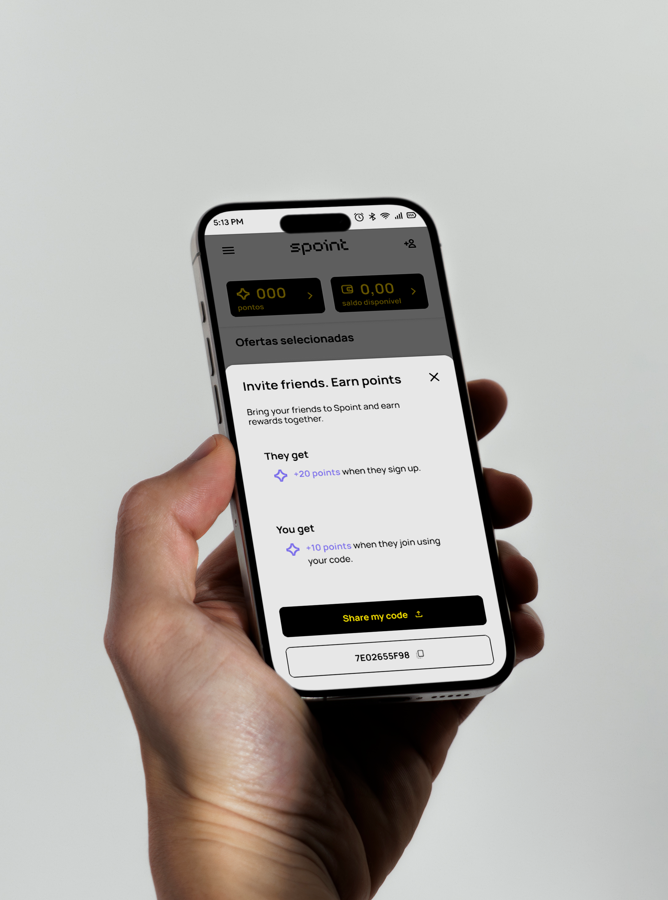
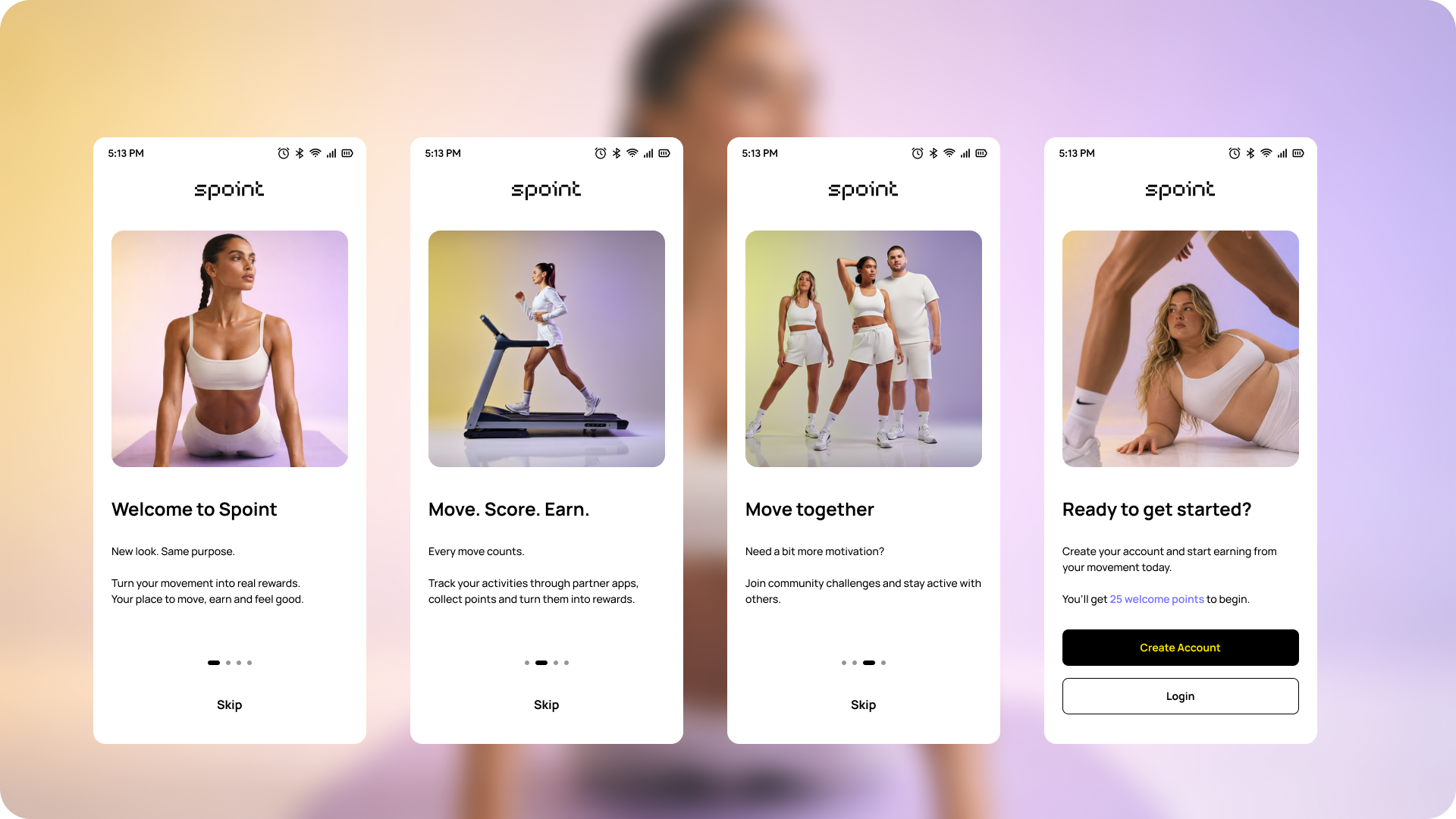
Redesigned core journeys
Onboarding and rewards flows were rebuilt with clearer guidance and more predictable steps.
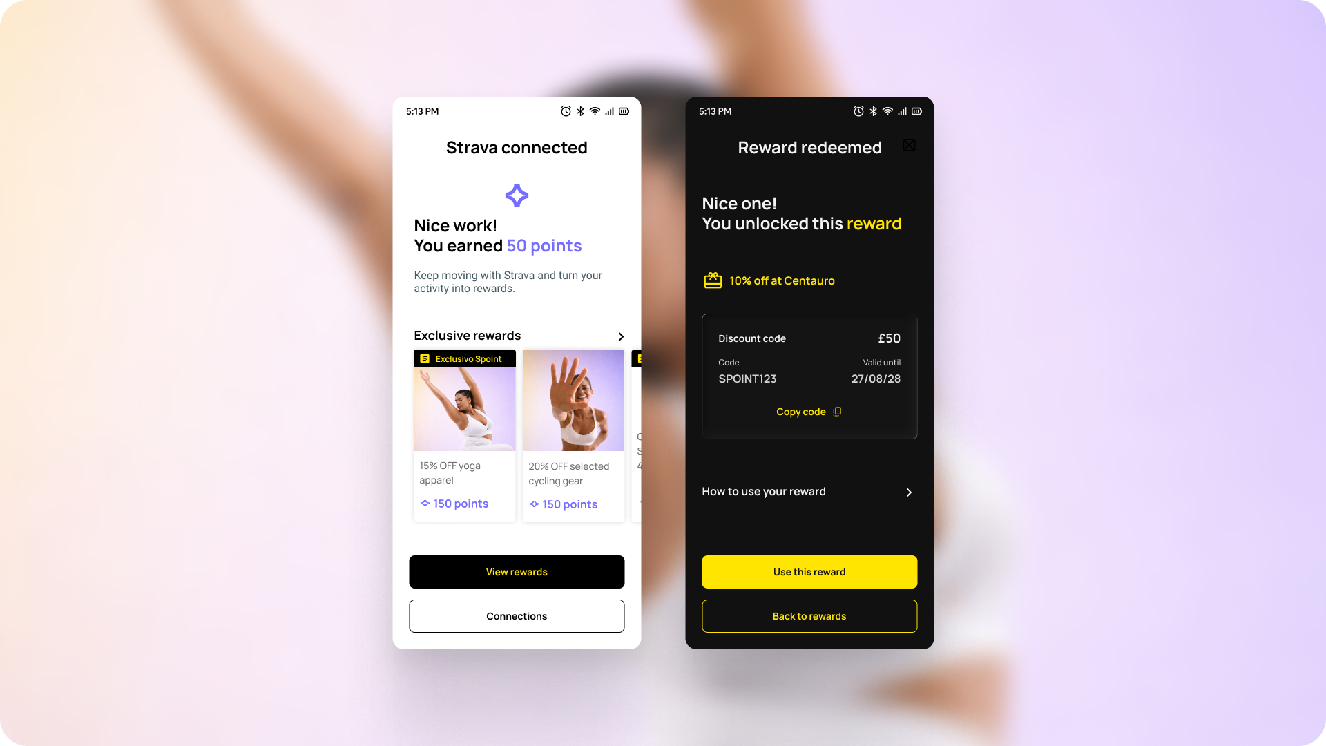
Improved visibility of system logic
Rules, deadlines and points became easier to find and understand throughout the experience.

RESULTS
The redesign improved clarity across the product and significantly reduced cognitive load for users
Readability analysis showed that content complexity dropped from university-level reading to secondary school level, making the product easier to understand for a broader audience.
Usability testing confirmed these improvements: all participants understood how the app worked, and most reported feeling more confident navigating the core journeys.
This project reinforced the importance of treating content as a structural part of the product experience. When information architecture and language are designed together, complex products become significantly easier to understand and use.
NEXT STEPS
Scaling the approach across the product and improving collaboration
The redesign created a clearer foundation for the product, with opportunities to expand the approach and improve how teams work with content.
Scaling across journeys
Apply the same content structure and patterns to other areas of the product.
Improving collaboration
Introduce better support for content ownership, updates and consistency across teams.